Fall 2020
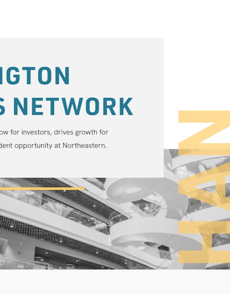
Huntington Angels Network
Huntington Angels Network connects Northeastern affiliated start-ups with angel investors and venture capitalists. To increase HAN's professionalism and credibility for their audience groups, the angel investors, venture capitalists, and students, we refreshed their brand identity and created a new marketing website. HAN's new brand is clean and accessible and its website is more user-friendly for their different audience groups.
The Team

Juwon Lee
Project Lead

Ally McCabe
Designer

Angelina Han
Developer

Brandon Yap
Designer

Erin Wang
Developer

Norman Wang
Designer
Investing in the Future
Huntington Angels Network is a student organization on campus that connects Northeastern affiliated start-ups with venture capital firms and angel investors. As a part of the Mosaic's entrepreneurial ecosystem, HAN is dedicated to helping the venture back-able companies with the fundraising process to foster a supportive community and professional networks for the new entrepreneurs. They also focus on building relationships with investors and providing them with a tailored deal flow that they can fully trust.
Rebrand: Increasing Communication and Raising Awareness
Huntington Angels Network came to Scout looking for a website branding to increase their professionalism and credibility. As a student organization engaging with investors and venture capital firms in a real professional world, HAN needed to come off as trustworthy and confident. Although their ability to facilitate over 2M in cash flow for ventures has been able to prove their success rate, they were struggling with their lack of brand and marketing presence and professionalism in that regard. With a new branding and marketing website, HAN wanted to enhance their credible identity not only for the investors and VCs, but also within Northeastern's entrepreneurship community to position themselves as a reliable and well-respected resource.
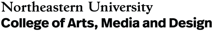
We started the project by completing a series of brand voice exercises together with the client, which allowed us to define HAN's new voice and understand what qualities should be emphasized in the rebrand. This exercise taught us that the main focus would be to increase communication and raise awareness through clean and clear, yet inviting design approach.
Consolidated brand voice exercise
Determining a Visual Identity
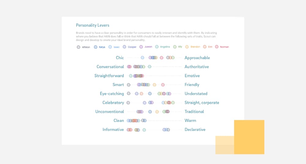
Before we dove right into the design and development of HAN's new marketing website, we began the visual design exploration stage by conducting market + competitor's research. Then, we combined our research findings and the outcomes from our brand voice exercises to create four distinct mood boards that ranged from conventional to boundary-pushing. After our client review, we landed on a direction that combines two mood boards at the opposite ends of the spectrum: minimal and professional, but also unexpected and proud.
Two final moodboards that range from expected to boundary pushing.
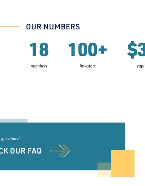
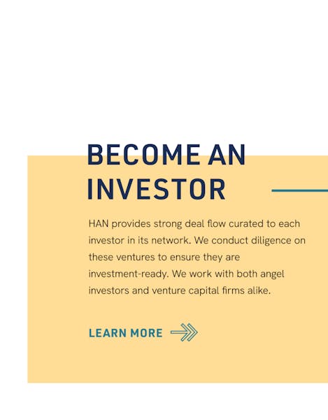
With our new direction, we transitioned into our design strategy process, where we began to explore more specific brand elements, such as colors, typography, UI elements, image treatments, and an example of a stylized UX block. Just like the mood boarding phase, our designers provided three distinct design strategies to explore all the different options that meet our client's criteria. With the emphasis on increasing credibility and professionalism in the investment world in mind, we initially explored ways to incorporate color and line overlays to stand out against the intentional, white negative space. Our client wanted to keep the soft gold element of the existing brand, so we chose soft, toned-down colors that would complement the gold and convey trustworthiness.
However, as we continued on with our development, we discovered that this new visual identity was straying away from the minimal and striking look the client had originally imagined. To accommodate this pivot, we revisited our initial design strategy and searched for a way to be cleaner, but bolder. As a result, we increased the brightness and saturation of our color palette and streamlined the graphic treatments to just color overlays.
In the meantime, we went through many rounds of logo refinement. Our client wanted a new logo that was more modern and clean to go with the new visual identity. We explored various different approaches—from very minimal, abstract, to literal ones. However, after rounds of refinement, we circled back to HAN's existing wing logo to keep the sentimental value. We cleaned up the wing to be more geometric and modern and paired it with HAN's new sans-serif typeface.
Creating an Informational Marketing Site
To follow the agile process within our short timeline, we also got started on the UX side of the project earlier on when we were defining the visual branding and identity. Our team created a detailed set of user-stories and an expansive site map in order to maximize the user's experience and communicate the information as straightforward as possible. We wanted to make sure that all the necessary information was clearly laid out for each of the audience groups and the flow of each page was smooth. Once these were defined, we developed a thorough set of low fidelity wireframes. Again, we primarily focused on information architecture and hierarchy at this stage so these wireframes were completely greyscaled with no branding elements.
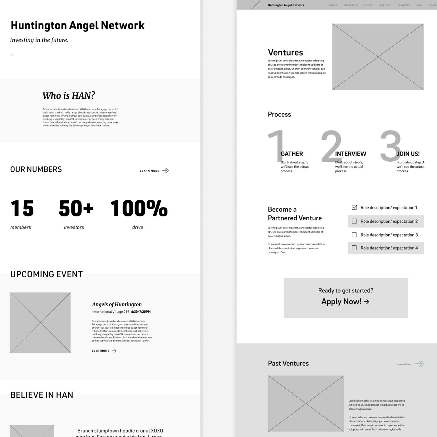
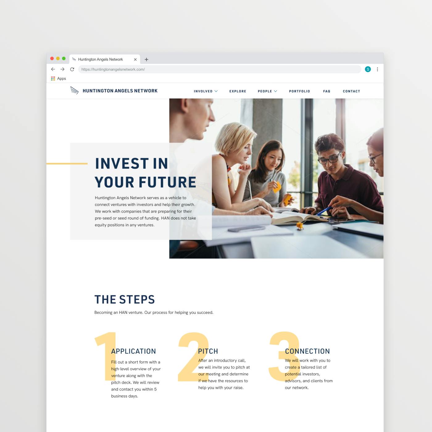
After our finalizing our design strategy pivot, the transition into high fidelity wireframes was a relatively smooth sailing. While incorporating color and visual elements, we particularly paid more attention to placements and layering of the new color overlays. Our team wanted the color block overlays to add dimensionality and excitement, while remaining more refined and orderly.
Final Wrap Up!
We are so grateful for the HAN team for being such a great client in terms of communication and flexibility. Their actionable and direct feedback helped us tremendously throughout the process to achieve our final branding elements and also to our abilities as designers.
""The Scout team was so fun to work with and I learned so much about the design process. Every meeting we had, we'd be blown away by the team's creativity and thoughtfulness.""
-Alfston Thomas, Director of HAN

Towards the end of the project, we faced some challenges with the scale of our scope. Unfortunately, we discovered pretty late in the project that our scope was much bigger than what only two developers could accomplish in the span of a couple months. In order to provide the Minimal Viable Product that we've promised, we had to make some adjustments in our design and overall timeline. However, they've shown so much support and flexibility in that regard, which allowed us to finish the website strong. Our two developers, Erin and Angelina, also went the extra mile by dedicating more of their time to create something that we are genuinely proud of. We learned so much about team work and communication through this project and we hope that our work gives HAN a better platform to grow as an organization!
Next Case Study
B612
Wanna stay in the loop?
Join our mailing list!