Fall 2020
Mango & Marigold Press
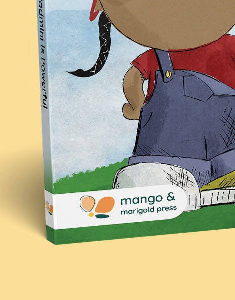
We rebranded a diversity focused publishing house which included book branding designs and an ecommerce website.
The Team

Stephanie Jung
Project Lead

Stephanie Miano
Designer

Cayla Chow
Designer

Judy Wong
Developer

Joe Annis
Developer
Designing for Diversity
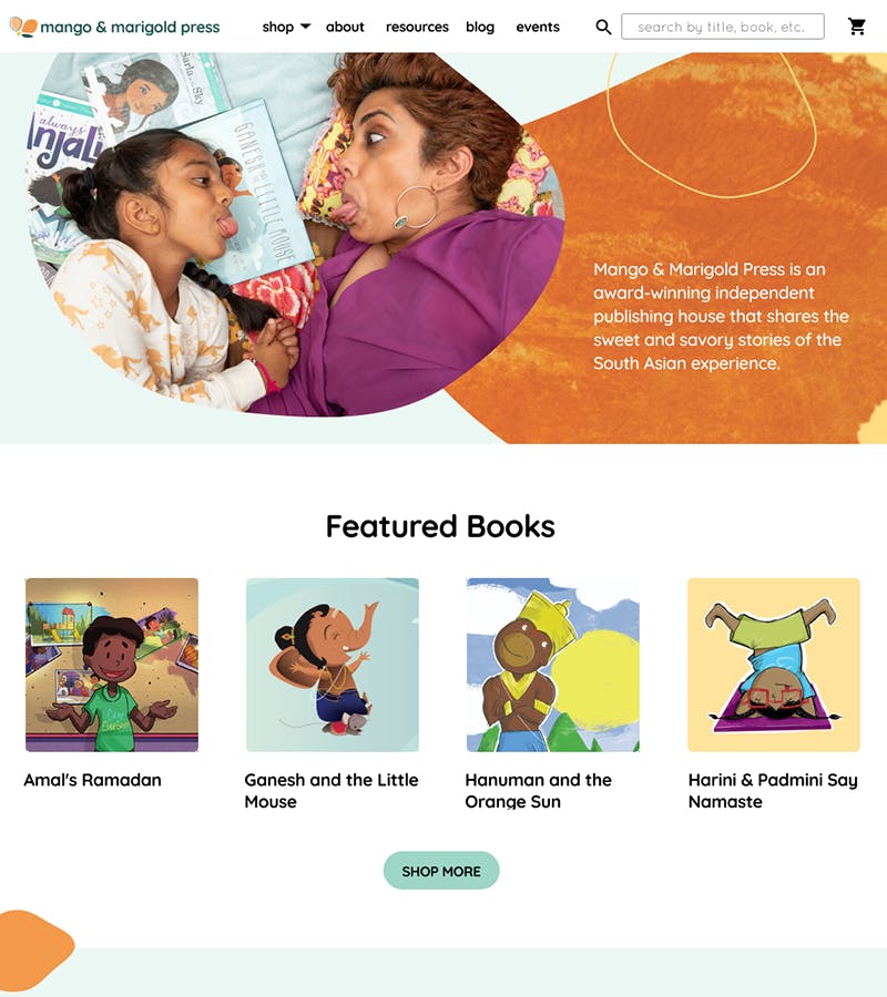
Mango & Marigold Press is an independent publishing house focused on sharing the South Asian story and diversifying bookshelves. The founder, Sailaja Joshi started the press when she struggled to find children's books that depicted her own Indian culture. Fueled by the power of representation, Mango & Marigold Press has received several awards for cultural diversity.
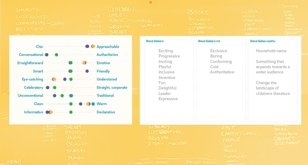
Brand Voice exercises and name brainstorming
Rebranding for Expansion
The client originally came to us as Bharat Babies. Although their books primarily focus on sharing the South Asian experience, they have readers with many different backgrounds. The client was looking for a new name and branding to broaden its appeal and reach more readers as it expands to include YA books. The brand needed to be engaging for both parents and kids, as well as include a YA sub brand that was aligned with the main brand but felt appropriate for older readers.
We started the project by completing a series of brand voice exercises. This allowed us to define the brand as it was as Bharat Babies and understand what qualities needed to be emphasized in the rebrand. The name needed to connect to the brand’s South Asian roots while celebrating its values of inclusivity and approachability. After much brainstorming, our client came to us with the name Mango & Marigold Press!
Determining Style Direction
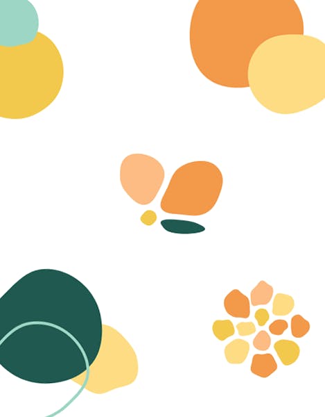
We began exploring visual design by creating a moodboard of style directions as well as gathering logos that the client thought were successful. From early on it was clear that blob shapes would be a big part of the design for the playfulness and personality they bring.
Our team went through many rounds of logo refinement. It was easy to jump to visualizations of mangos and marigold flowers. However, we found that a mango shape is not very distinct and the detail required to portray a marigold was too complex. Additionally, since we were designing for a literary press, the logo needed to go beyond the literal and emphasize creativity and discovery.
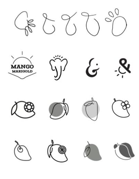
Our breakthrough on the logo didn’t come until after defining the rest of the branding elements. The direction to head in for color and typeface was much clearer. Moving forward, with those elements our team also began to explore blob shapes as supporting elements on the website. Seeing how excited the client was by those blobs, we shifted our logo exploration to incorporate those shapes that were now a part of the brand language. The Mango & Marigold logo evokes youthfulness and invites discovery in its ambiguity.
Creating An Ecommerce Site
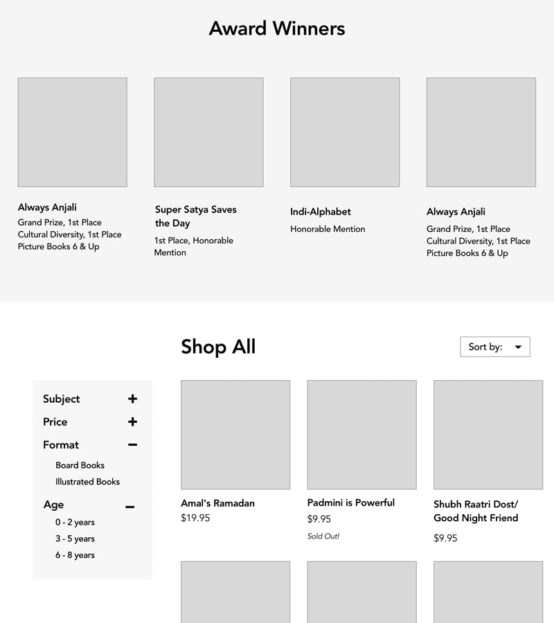
As we were defining the branding, our team started on wireframes. The client's previous site served as a good template for the new site map. One thing we noticed was that the shop had pages for different book categories but it wasn’t easy to view and filter all the books at once. In addition to adjusting the filter functionality, we also included featured and award winning books to enhance the shopping experience.
Once our brand elements were defined, the Hifi designs were quick to follow. Expanding off the blob shapes of the branding, we created a custom footer shape and custom social icons. While the blobs had been the driving force for the design, our team stopped to consider how we could push them further and add more dimensionality to the design. We created texture swatches by dipping mangos and flowers in paint. The texture and organic shapes created add playfulness and tactile quality to the design language.
The clients old website used Shopify which we were able to build off of. However, Shopify along with Liquid proved to be challenging frameworks to work with. Support resources were limited and they didn’t lend themselves well to custom development.
"It took a lot of team communication to figure out what was going on and make sure things were going well"
-Joe Annis


Final Outcomes
Overall, this project taught us a lot about the power of communication. As mentioned, it was critical for the development of the website. Without our developers’, Joe and Judy, hard work, we would have nothing to show. Additionally, our client meetings had to be online throughout the semester when typically they are in person. It was initially difficult to form a connection with the client when there was a screen separating us. However, we learned to dig deeper into the client feedback and make the most of those meetings. The more we had to go off of, the further we could push our progress to present the next week. Now in the era of Zoom, this experience has made us better equipped for the challenges online communication presents.
You can check out the final site here!
Next Case Study
City Hall Student Action Portal
Wanna stay in the loop?
Join our mailing list!